Fintech
2023 Spring
MY ROLE
Lead User Interface Designer
TEAM
Kun.Lin (Senior UI )
Amber.H (Senior UI )
Luyuan.Li (Senior UX )
Key. Chan (PM )
SCCBA Design Team
Bigbang Junior Design Team
CLIENT
Kolmar Korea
CATEGORY
UI
Design Direction
Brand Story
Problem
Given the widespread adoption of mobile banking in China, traditional personal web banking is facing an identity crisis in the financial product channel.
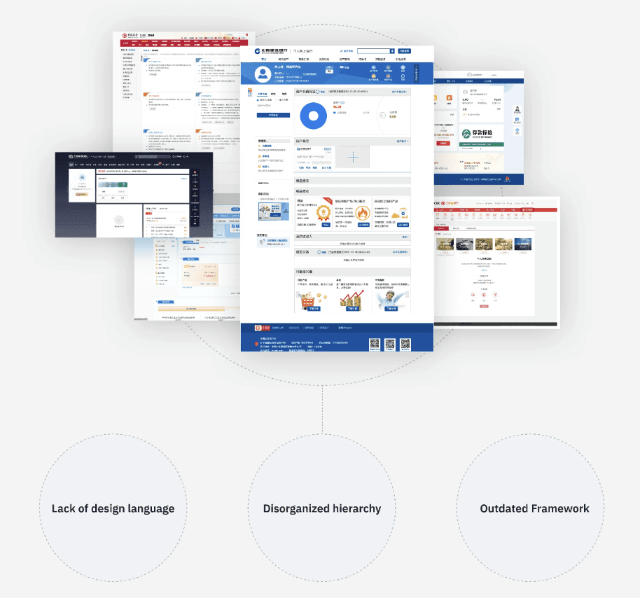
Due to previous oversight of the personal web banking channel, there's a lack of a refined and unified visual strategy to assist the team in designing and developing for member banks within the product.
These can lead:
Inconsistency in User Experience (User)
Resource Allocation Challenges (Company)
Competitive Disadvantage (Brand)
Missed Opportunities for Unique Services (Product)
Goal
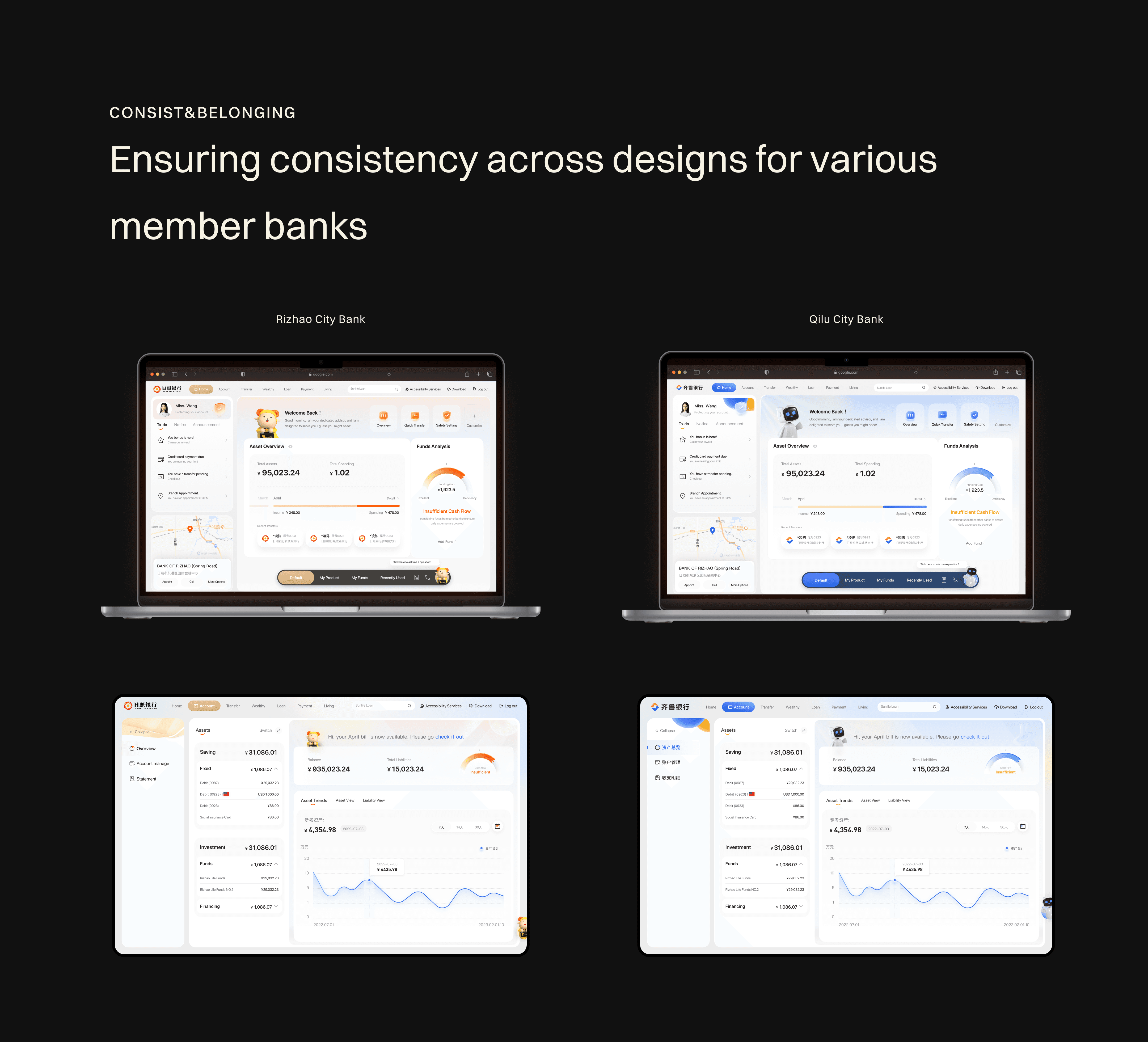
Make a Consistent Look and Feel: Create a design that makes web banking easy and pleasant to use across all banks in the alliance.
Use Resources Better: Come up with a design that's easy to apply to all banks so they can save time and work more efficiently.
Stand Out from Competitors: Add new features and improvements that make SCCBA's web banking better than others.
Optimize Cross-Platform Integration: Enhance the connectivity and interaction between different banking channels (web, mobile, in-branch) to provide a cohesive and integrated customer experience, making it easier for users to switch between platforms seamlessly.
Process
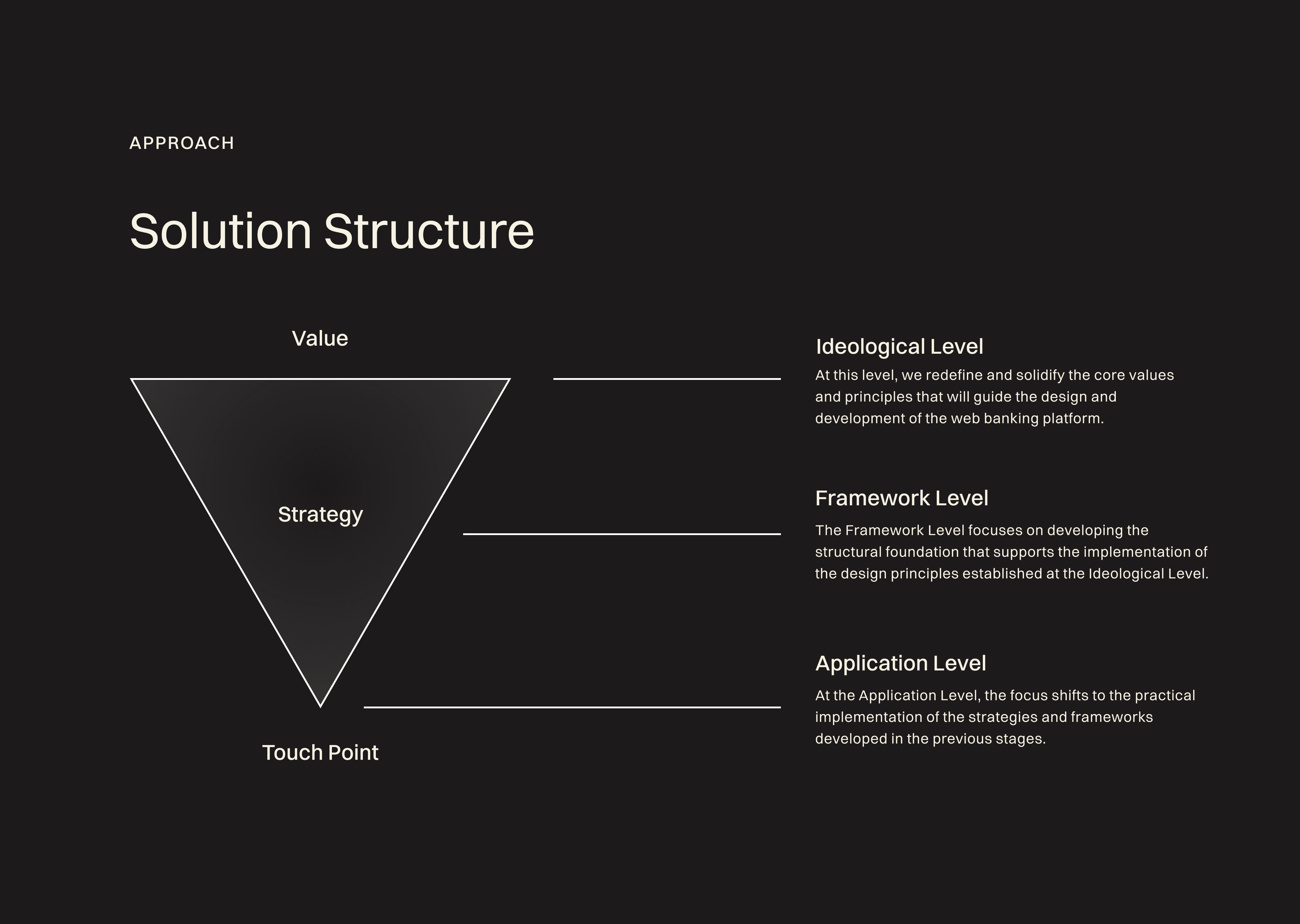
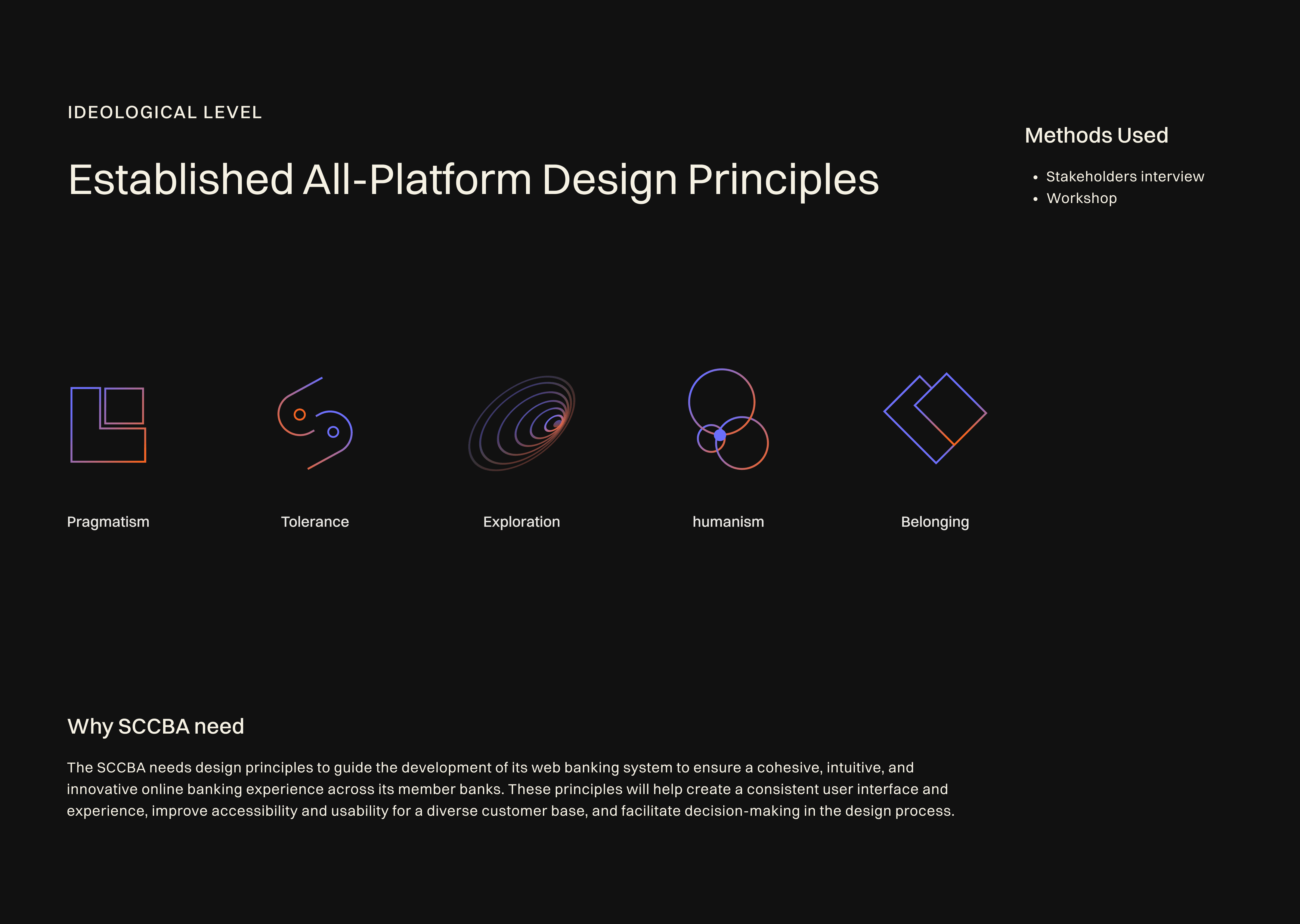
Ideological Level
Problem Insight One
During the initial interactions with the SCCBA internal team, I identified a key factor contributing to the disarray in the online banking products: The diverse perspectives and lack of a unified value system within the SCCBA team lead to inconsistent design approaches and objectives, which can dilute the user experience and hinder the platform's effectiveness.
Solution
Establish a set of core values and design principles in collaboration with all team members. This unifies the team's vision and approach, ensuring that every decision and design reflects these shared values, leading to a coherent and purposeful user experience.
Methods
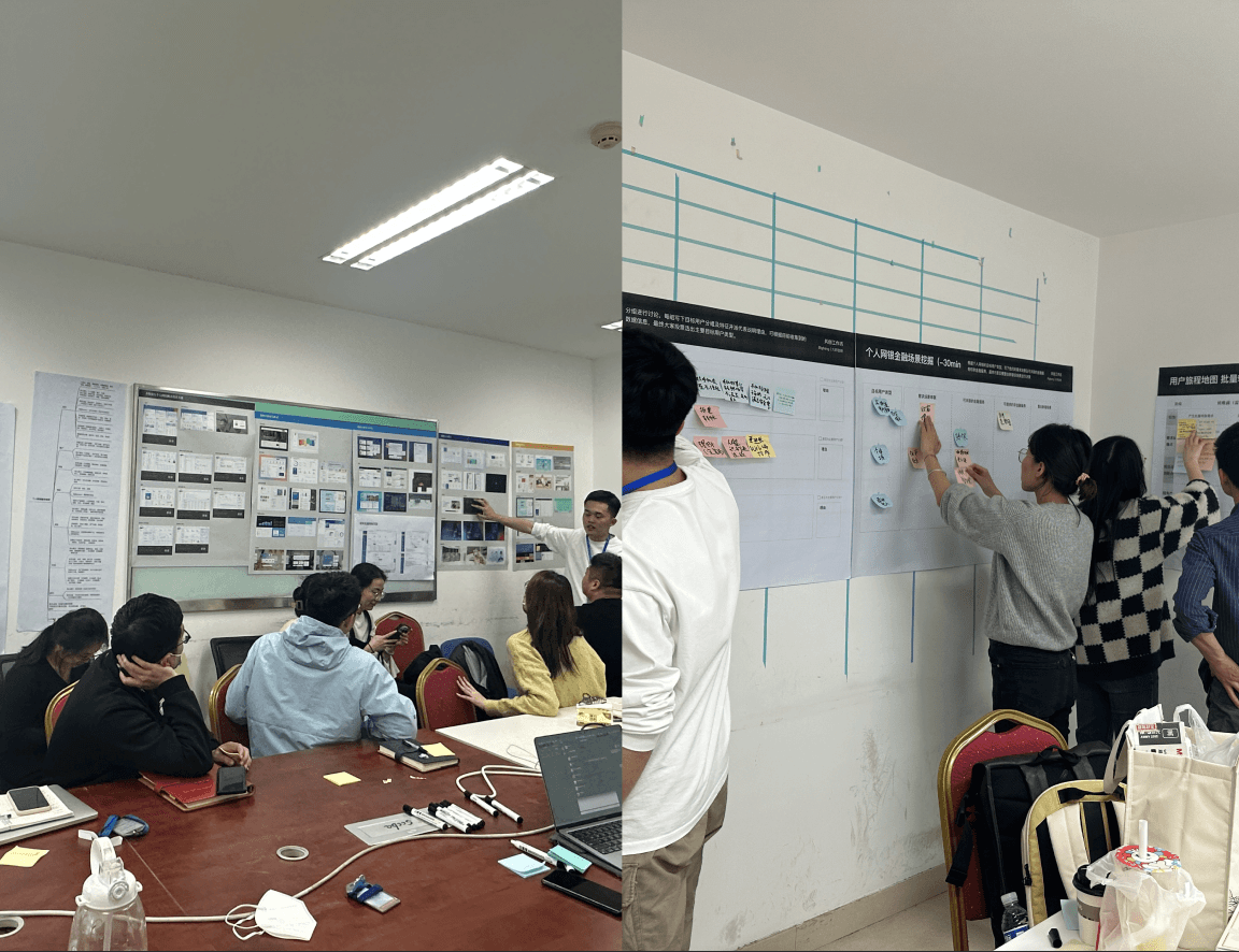
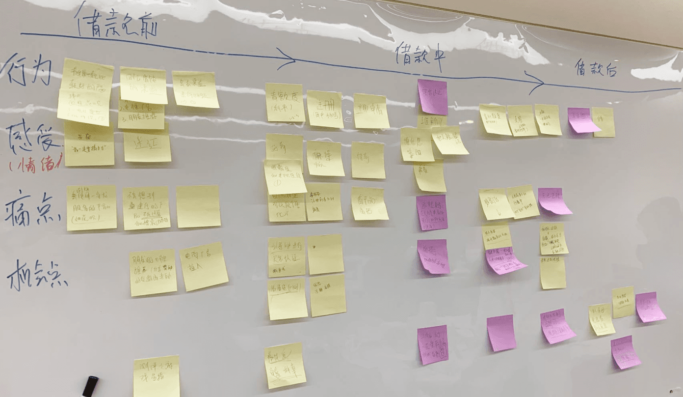
Stakeholders interview: To gather insights, expectations, and perspectives from all key stakeholders, including team members, management, and potential users.
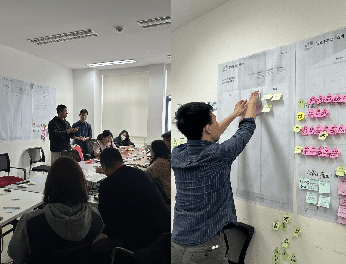
(Kun) Principles Workshop: I conducted sessions where the results from the workshops and interviews were presented and discussed. We used collaborative activities, such as value sorting exercises, to collectively identify and prioritize the core values that resonate with the entire team.
Result
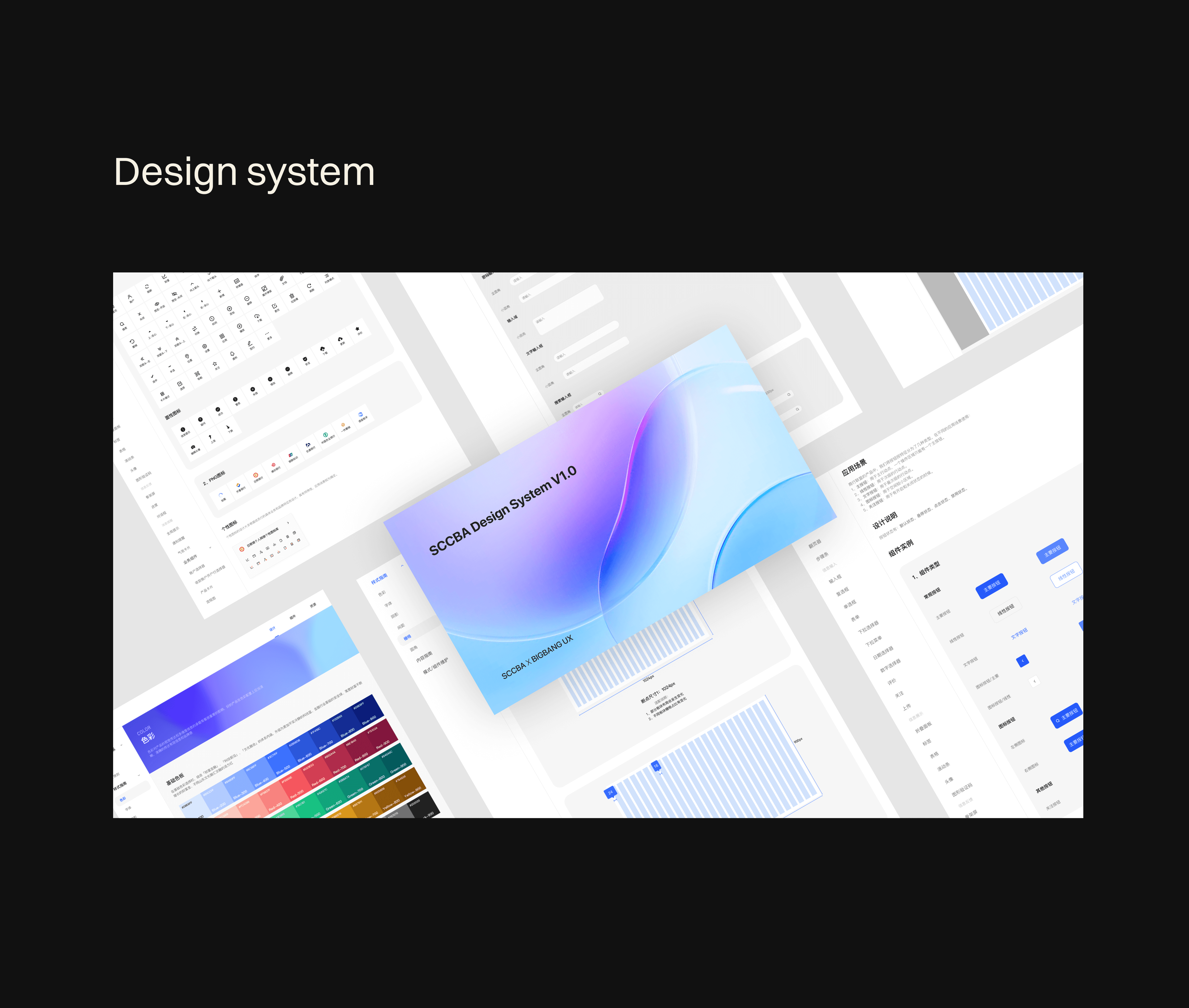
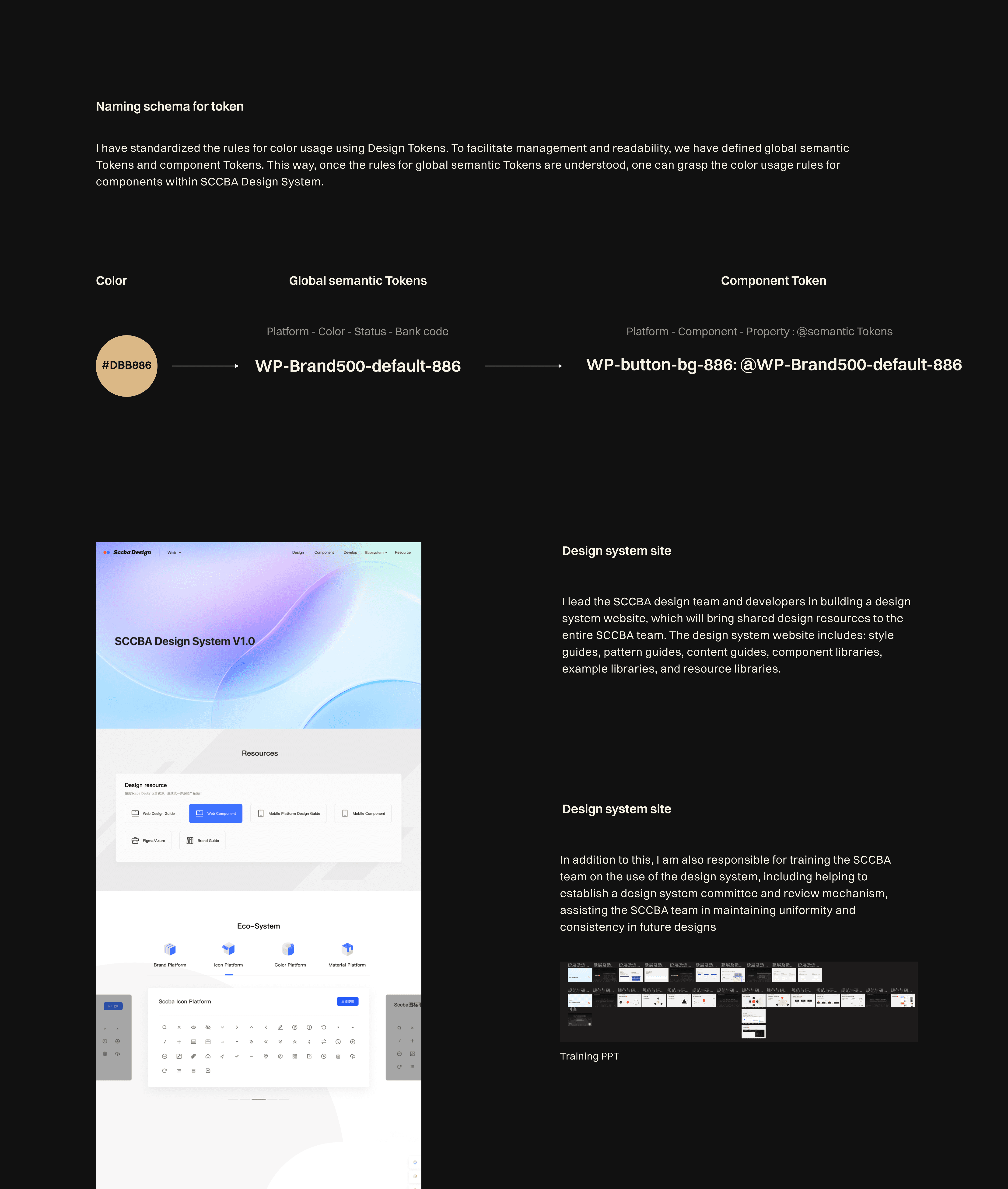
For SCCBA: Successfully established a Design System Committee composed of members from the design, product, and development teams, instituting a first-generation component review process. This cross-functional committee facilitated collaboration across departments, ensuring that all components and design elements adhered to our unified design principles and met the highest standards of quality and usability. This initiative not only streamlined the design and development process but also significantly enhanced the coherence and consistency of the user interface across the platform, setting a solid foundation for scalability and future innovation.
For Our Team: This alignment has also streamlined our design and development processes, reducing conflicts and redundancies, and ultimately, accelerating our progress towards delivering a product that sets new standards in the digital banking experience.
Strategy Level
Problem Insight Two
At the strategy level, the primary challenge is determining how to effectively implement the core values and design principles in a way that addresses market needs, stays ahead of technological trends, and ensures the platform is scalable and adaptable to future changes.
Solution
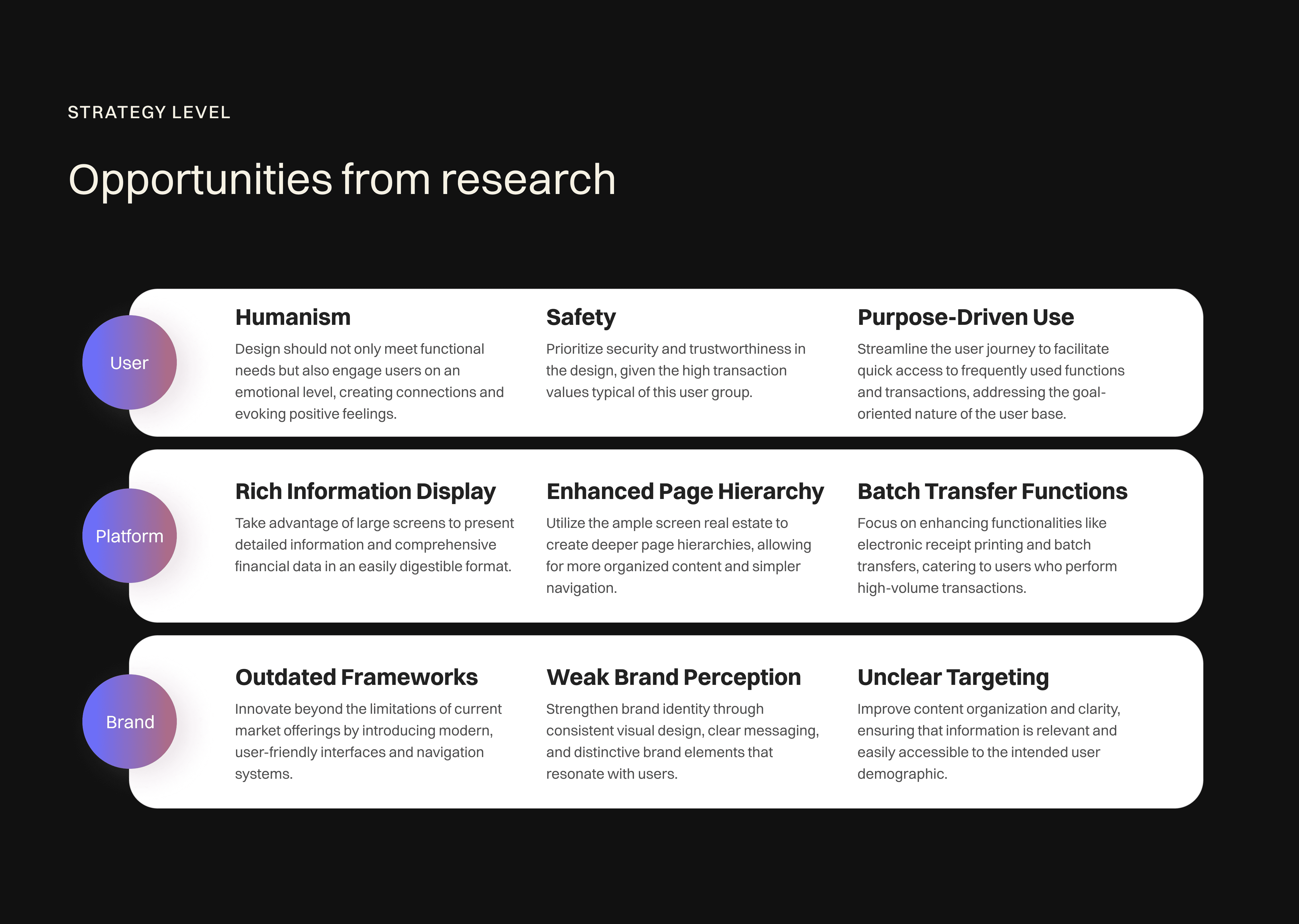
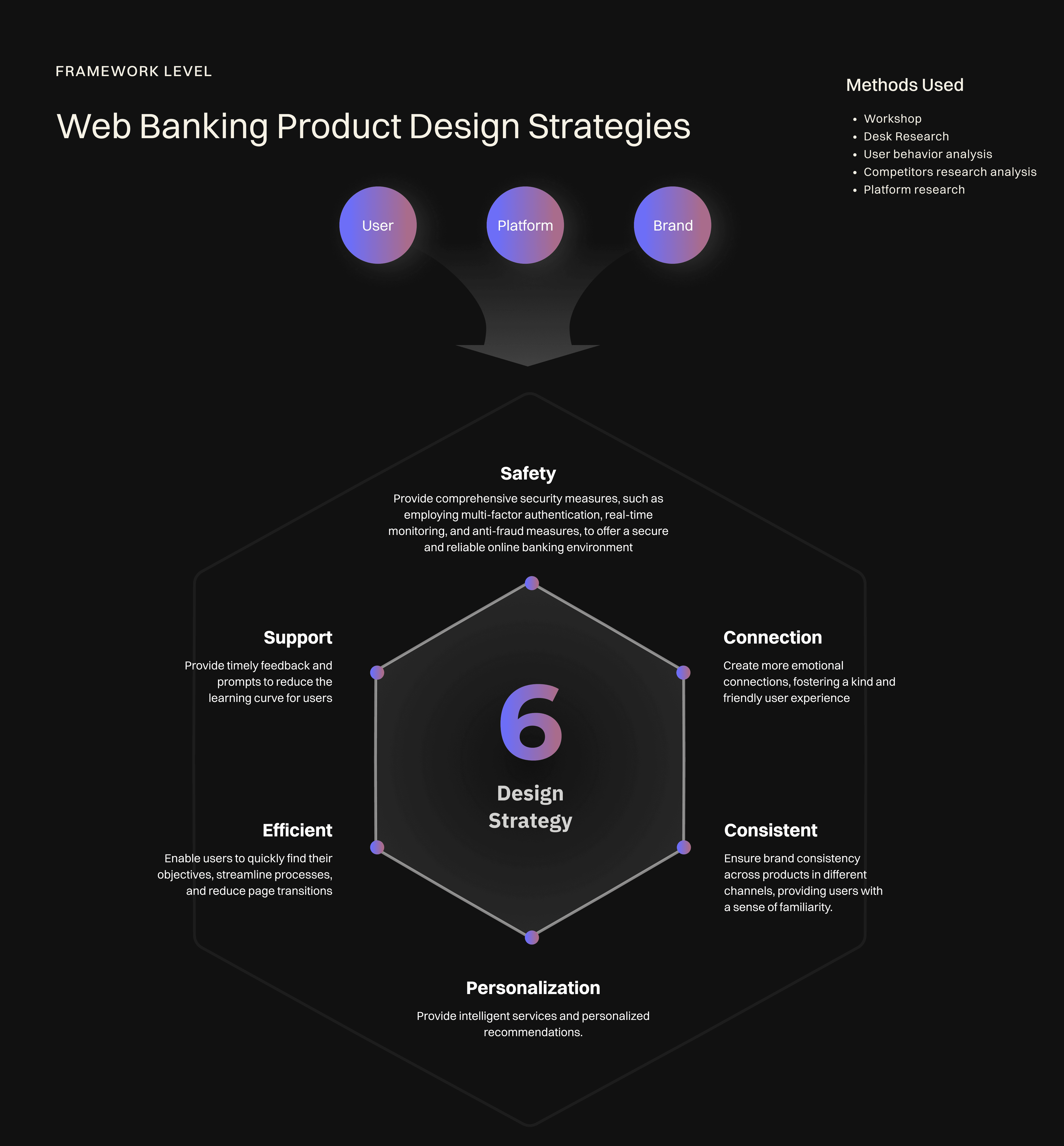
the solution is constructed around analyzing the needs across 3 key dimensions: Users, Platform, and Brand. This approach ensures a comprehensive strategy that aligns with core values and design principles while being responsive to market demands.
Methods
(Brand) Competitor analysis: I analyze the leading financial institutions (13 companies) and a broad financial category institution (1 company) in personal online banking, conducting our analysis from six perspectives to identify opportunities.
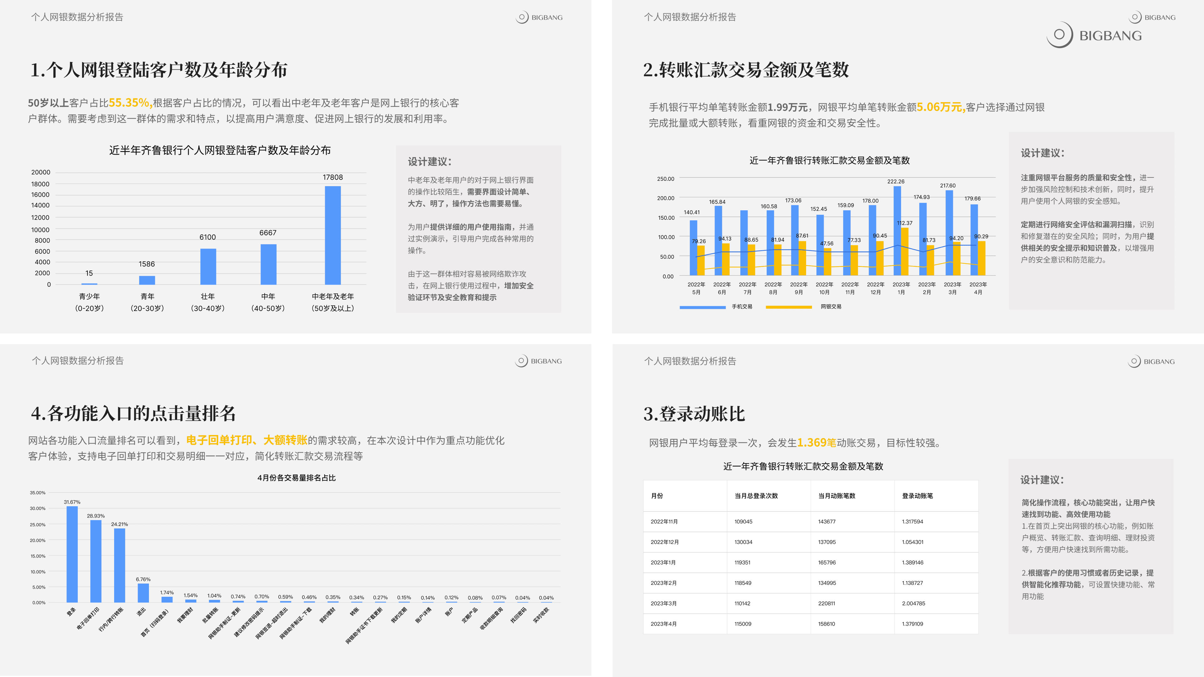
(User) User analysis: Analysis of user characteristics, frequently used functions, user behavior, and personal online banking data aims to better understand user needs and preferences, improve bank products and services, and increase user satisfaction and loyalty.
(Platform) Platform analysis: Primarily through desktop research, opportunities are identified by exploring the characteristics and features unique to different platforms.
Insight
Research indicates that web banking users, predominantly aged between 35-40, exhibit goal-oriented behavior with a focus on specific functions, such as executing large-volume transactions or reviewing account assets. This user preference is primarily attributed to the web platform's larger screen size, which offers a more intuitive and convenient interface compared to mobile devices, thereby facilitating more complex financial activities with ease.
In brand-related research, it has been found that most web banking platforms are still operating within design frameworks established several years ago. Compared to other channels within the same brand, these web platforms exhibit outdated design styles, leading to a disconnect in brand perception. This inconsistency poses challenges in maintaining a cohesive and professional brand image across different platforms.
Things I learned
This project, a collaborative effort involving multiple teams and departments, imparted a crucial lesson: as a designer, it's equally important to guide and inspire enthusiasm within the client's team. Starting with our initial workshops, we engaged every team member in defining shared values, fostering their sense of responsibility and involvement in the project. Later, as I worked alongside the client's design team to build the design system, this collaborative approach significantly smoothed the project's progress. It was gratifying to witness their designers grow alongside me, and the transformation within the client's team reaffirmed the success of our consultative approach.
